
[fig A ] HIGHSPRING
Agility at work.®
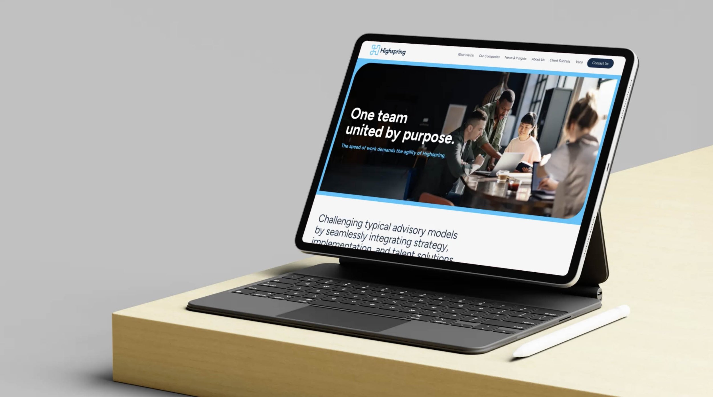
Highspring is a global professional services organization that challenges the typical advisory model by seamlessly integrating consulting, talent solutions and managed services. After years of acquisitions and segmented business lines, we helped shape and define their new uniform brand from the ground up.
CLIENT: Highspring/Vaco
MEDIA: Brand Identity, Strategy, Brand Architecture
[fig B] LOGO
Like a letterform carved from a block of granite, we augmented the H in Highspring to signify the building blocks of an organization. Using a combination of smooth and rigid angles, the mark was built to evoke a sense of depth and shadow while simultaneously remaining flat and simple.


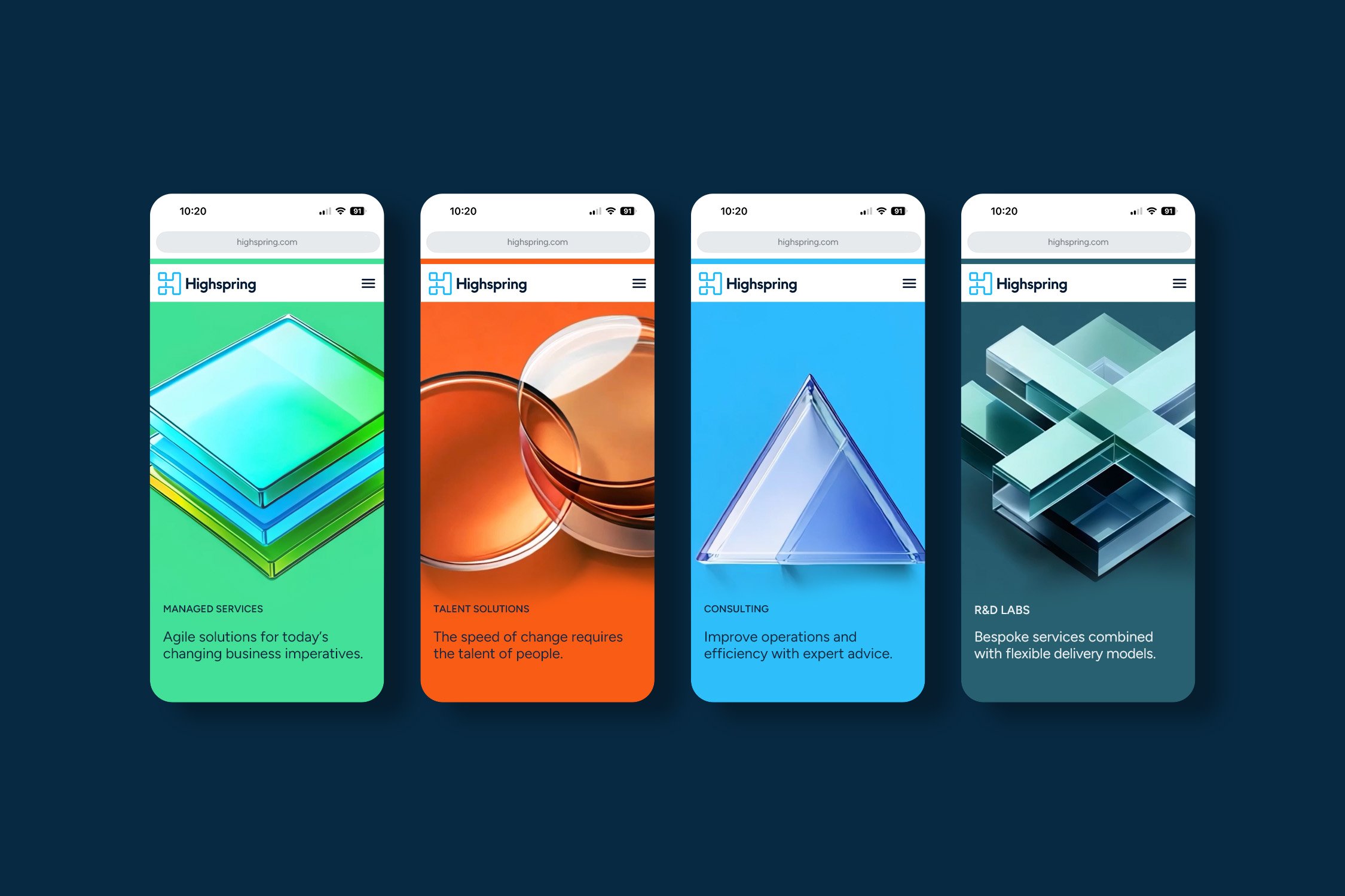
[fig C] SERVICE LINE BRANDING
We developed a system of three-dimensional shapes and color-ways in order to differentiate Highspring’s numerous service lines and verticals. Each geometric shape created a visual parallel to brand attributes such as Order, Flexibility, Connectivity, Agility and more.
[fig D] SHAPE & ICONOGRAPHY
We created a simple shape that combined both square and sharp corners. The ownable shape allows the system to flex for a wealth of assets such as photographic frames, modular UX and iconography.


A part of the Vaco family of brands, Highspring is a SaaS platform that helps businesses manage and grow their operations, including aspects like marketing, sales, and customer service.